Building reusable UI components in Rails with ViewComponent
Reusable UI components are user interface widgets or elements that can be used in various places in a web project. These components are typically small and created for a specific functionality.
Typically, you write the code once and then import the UI components wherever needed. For example, you can create a card component that displays certain information or have a navigation bar that will appear at the top of all web pages. Such UI elements can be imported and added to your desired web page. Other examples of reusable UI components are input fields, buttons, modals, and progress bars.
There are multiple reasons as to why you should use reusable UI components:
- They help you save time and effort. As the name suggests, these UI elements can be reused on different pages rather than coding everything from scratch.
- Reusable UI components improve code quality and maintainability and bring more consistency to your project.
- Having reusable components also makes your project more modular, allowing you to break down the task into smaller, more manageable chunks.
- Tracking down and isolating errors and bugs in a modular application is always easier.
In this tutorial, we will help you understand how to identify reusable components in your project and how to develop these UI widgets in Rails. Let's jump in.
Identifying and extracting reusable components
It's always a good practice to analyze the structure of your application and identify parts that can be broken down into smaller, reusable components. To do this, start by looking at common functional patterns evident at multiple places in your application. Be sure to pay attention to the relationship between models, controllers, and views to identify areas where they share logic or functionality.
You should also inspect your application, looking for instances of repetition in the code. When you find duplicate code in your application, it may indicate that a reusable component is required. Reviewing your view templates and files can help you find common HTML elements, forms, and other components to modularize.
Creating reusable components
In this step, we will learn how to create a reusable component in Rails using ViewComponent.
Using ViewComponent
ViewComponent is a Ruby on Rails library that helps create reusable and encapsulated UI components for your application. By breaking down an application into smaller chunks, this framework makes it easy to perform unit tests and track down sources of error, facilitating faster debugging.
We will create the following simple website using reusable components. Specifically, we will create two reusable UI components: the navigation bar and the product card.
Getting started
Add the following code to your Gemfile.
gem "view_component"
Run the bundle install command to install the ViewComponent library into your project. You should see the following output if the installation was successful.
$ bundle install
Fetching gem metadata from https://rubygems.org/
Resolving dependencies...
Using rake 13.0.6
Using concurrent-ruby 1.2.2
Fetching view_component 3.6.0
Using rails 7.0.8
Installing view_component 3.6.0
Bundle complete! 15 Gemfile dependencies, 76 gems now installed.
Use `bundle info [gemname]` to see where a bundled gem is installed.
Creating components
Components are subclasses of ViewComponent::Base. Whenever we create a ViewComponent, an app/components directory is also generated to store all of our components' files.
When naming components, it's best practice to name them according to what they do or render instead of what they accept. For example, we can have a CardComponent rather than a ReportComponent.
Components can contain HTML, CSS, and JavaScript code. We can also add logic to guide the behavior of these components in a separate Ruby class.
We can create a ViewComponent by running the following code. In this case, we'll create a simple navigation component using the generator. We can pass a name or other arguments to the component.
bin/rails generate component Navigation nav
You should see the following outputs in the terminal.
$ bin/rails generate component Navigation nav
      create  app/components/navigation_component.rb
      invoke  test_unit
      create    test/components/navigation_component_test.rb
      invoke  erb
      create    app/components/navigation_component.html.erb
As shown above, we have generated a navigation_component file to store our component's logic and the navigation_componnet.html.erb for our actual HTML and CSS code.
The navigation_component should appear as follows:
# frozen_string_literal: true

class NavigationComponent < ViewComponent::Base
  def initialize(nav:)
    @nav = nav
  end

end
While the navigation_component.html.erb file looks as shown below:
<div>Add Navigation template here</div>
As shown below, we can add some nav elements to the template. We're using TailwindCSS for styling, but you can also use custom stylesheets.
<div class="bg-red-200 py-4 border-b text-xl">
  <ul class="flex">
    <li class="mr-6">
      <a class="hover:text-blue-800" href="#">Home</a>
    </li>
    <li class="mr-6">
      <a class="hover:text-blue-800" href="#">Phones</a>
    </li>
    <li class="mr-6">
      <a class="hover:text-blue-800" href="#">TVs</a>
    </li>
  </ul>
</div>
We can render the component by adding the following code snippet in the respective view. In this case, we will render the element in the `application.html.erb' layout file since we want it displayed across all web pages.
We use the <%= render NavigationComponent.new(nav: @nav) %> code to render the nav component in the browser, as shown below.
<!DOCTYPE html>
<html>
  <head>
    <title>Shopit</title>
    <meta name="viewport" content="width=device-width,initial-scale=1">
    <%= csrf_meta_tags %>
    <%= csp_meta_tag %>
    <%= stylesheet_link_tag "tailwind" , "inter-font", "data-turbo-track": "reload" %>

    <%= stylesheet_link_tag "application", "data-turbo-track": "reload" %>
    <%= javascript_importmap_tags %>
  </head>

  <body>
    <main class="container px-6">
     <%= render NavBarComponent.new() %>
      <%= yield %>
    </main>
  </body>
</html>
Let's go ahead and create a new CardComponent that we will use to display items retrieved from the database to the user.
To generate the component, we run the following command.
bin/rails generate component ItemCardComponent title description
In this case, the title and description are the product variables we wish to display to users. Once again, you should see the item_card_component.rb and item_card_component.html.erb files in the components folder.
Here's how the item_card_component.rb should appear. We will later pass the title and description parameters in the index.html.erb file:
# frozen_string_literal: true

class ItemCardComponent < ViewComponent::Base

  def initialize(title:, description:)
    @title = title
    @description = description
  end

end
We can retrieve the values passed to the ItemCardComponent in item_card_component.html.erb, with the following.
<div class="max-w-sm rounded overflow-hidden shadow-lg m-2 p-4 bg-green-400">
  <h4 class="font-bold text-xl mb-2"><%= @title %></h4>
  <p class="text-gray-400 text-base"><%= @description %></p>
</div>
We can also create a BannerComponent, which allows us to communicate certain information to users using the following command.
bin/rails generate component banner title message
The BannerComponent will accept a title and message when initialized.
# frozen_string_literal: true

class BannerComponent < ViewComponent::Base
  def initialize(title:, message:)
    @title = title
    @message = message
  end

end
We will then access these values in the banner_component.html.erb file and display them to the user.
<div class="bg-blue-500 text-white p-4">
  <h1 class="text-2xl font-bold mb-2"><%= @title %></h1>
  <p class="text-lg"><%= @message %></p>
</div>
Finally, we can render the ItemCardComponent and BannerComponent in the index.html.erb file using the render() method, as shown below.
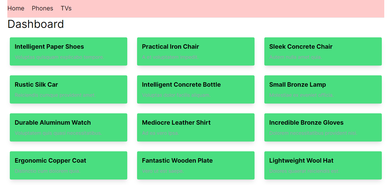
<div class="flex-auto">
<h1 class="text-4xl mb-4">Dashboard</h1>

<div class="grid grid-cols-3 gap-4">
  <% @products.each do |product| %>
    <%= render(ItemCardComponent.new(title: product.title, description: product.description)) %>
  <% end %>
</div>
<%= render(BannerComponent.new(title: "Status", message: "Completed")) %>
</div>
You can download the full code used in this tutorial from this GitHub repository.
Best practices for building reusable UI components
Reusable components are an essential part of front-end web development. They allow you to break down large complex UIs into smaller components, which are easier to manage and debug. Here are some principles you should follow when creating reusable UI components.
- Ensure that each component plays a specific responsibility to make it easier to understand their usage and how the components fit into a project.
- Use props to pass values to UI. Reusable components are flexible, configurable, and dynamic. They can accept different types of data, including collections, strings, and objects, which extends their usability.
- Consider separation of concerns. A ruby file is also created whenever you generate a component with the ViewComponent library. You can add your logic to this
.rbfile and access it directly in your view component. Separation of concerns keeps your code clean and allows you to identify errors in your project quickly. - Add component-specific styling. Instead of combining your CSS styles in one file, you can include CSS inside specific component files to achieve that minimalistic look.
Conclusion
In this article, we've learned how to create reusable components in rails using ViewComponent. These UI components can help achieve consistency in design and functionality across your application. You can also combine these UI elements to create complex UI designs. Consider implementing reusable components using ViewComponent in your next Ruby on Rails project.

Written by
Michael BarasaMichael Barasa is a software developer. He loves technical writing, contributing to open source projects, and creating learning material for aspiring software engineers.