How a status page can show a site at its best (and 10 examples)
Your status page is a bridge to your customers. It’s where you show what you can do and prove that your product is more than just sales talk. Though easy to overlook, it provides an opportunity to showcase all that’s best about your services.
The trick is how to do it well. Fortunately, there are many outstanding status pages that you can draw inspiration from. Once your ideas take shape, you're ready to present your vision to customers.
In this article, you’ll learn what a public status page can do, why you should have one, and what it takes to make a good one. After that, we'll run through some status page examples that show what others have achieved with their pages, and then we'll show how easy it is to set up a status page using Honeybadger.
Why is it important to have a public status page?
Using your services is an act of faith that you need to earn and then repay. Customers want to know they can trust you, and a public status page lets you demonstrate your reliability. If you’re achieving 100% uptime, it’s the place to show it off.
It’s a plain-speaking, fact-driven demonstration of your commitment to your customers and a showcase of your ability to deliver a useful, usable product. Your status and incident communication skills are a key part of customer relationship management.
Strong metrics on your page show that you can help your customers achieve their own goals. However, when things do go wrong, being transparent about it via a dedicated status page makes it less disruptive. It’s less of a shock if users understand the situation or receive advance notice of scheduled maintenance. They can see what’s happening and that you're working to resolve the issue.
What should a strong status page include?
A good status page isn’t just about looking good. It’s about presenting information your clients need, and helping them find it. Here are some points you should consider when designing your page.
-
Clarity: The main function of a status page is to let users know that your services are running. Function takes precedence over form, though it never hurts if your site is pleasant to look at. Easily readable and findable information ensures your users have a positive experience.
-
Metrics: Uptime is the key metric for a status page, but general service health and response times matter too. You don’t have to be comprehensive, but presenting additional data can help. Showing planned maintenance or scheduled downtime is also useful, as is providing date switchers to change the displayed periods.
-
Links: The dual goals of presenting information while keeping things simple can be at odds with each other. Links can provide further information to those who need it without cluttering things for everyone else. A link to your support page or to any of your other online services is also a good idea.
10 great status page examples
Now that we've looked at the theory, let's take a look at some of the best status page examples. These great examples show the system status for various services, displaying metrics like historical uptime, response times, and third-party service info. Most have a user-friendly interface and show detailed status updates whenever there's a change. Studying these can help you decide what to include on your own page.
Wistia
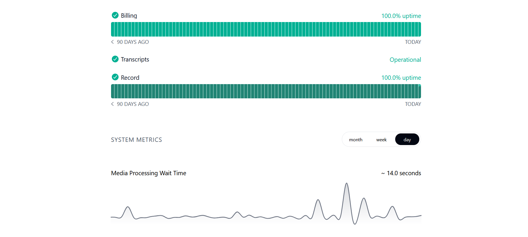 As well as uptime, Wistia shows you its media processing time history
Wistia is a video management platform for those looking for something a little more businesslike than YouTube. Its status page packs in plenty of information, but still manages to be clear and readable. You can see what’s happened over the last 90 days, with more detail available by mousing over each day, and there are options to change the period shown. There’s also a useful graph showing media processing wait time. The page also includes incident reporting and various other information channels.
Strengths: Comprehensive. Readable. Crisp.
Okta
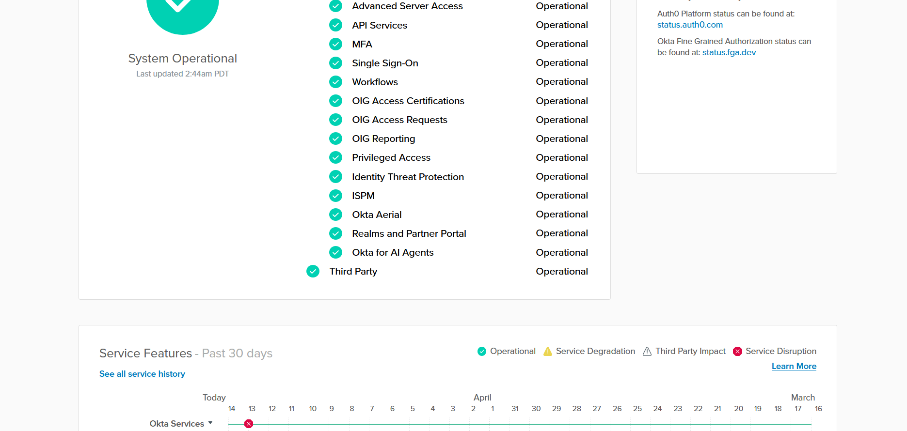 Okta’s page includes a reassuring tick, and a calendar showing service disruptions
Okta is an identity and access management platform. Its site strikes a useful balance between simplicity and detail. There’s a nice big tick to quickly show that things are working, followed by a single page of alphabetically listed services that provide more specific information.
There’s an unusual calendar display that shows you what’s happened over the past month, too. The site’s clear design and color coding show you what’s going on without you needing to figure anything out. There are also various useful links.
Strengths: Straightforward. Original. Detailed.
Flare
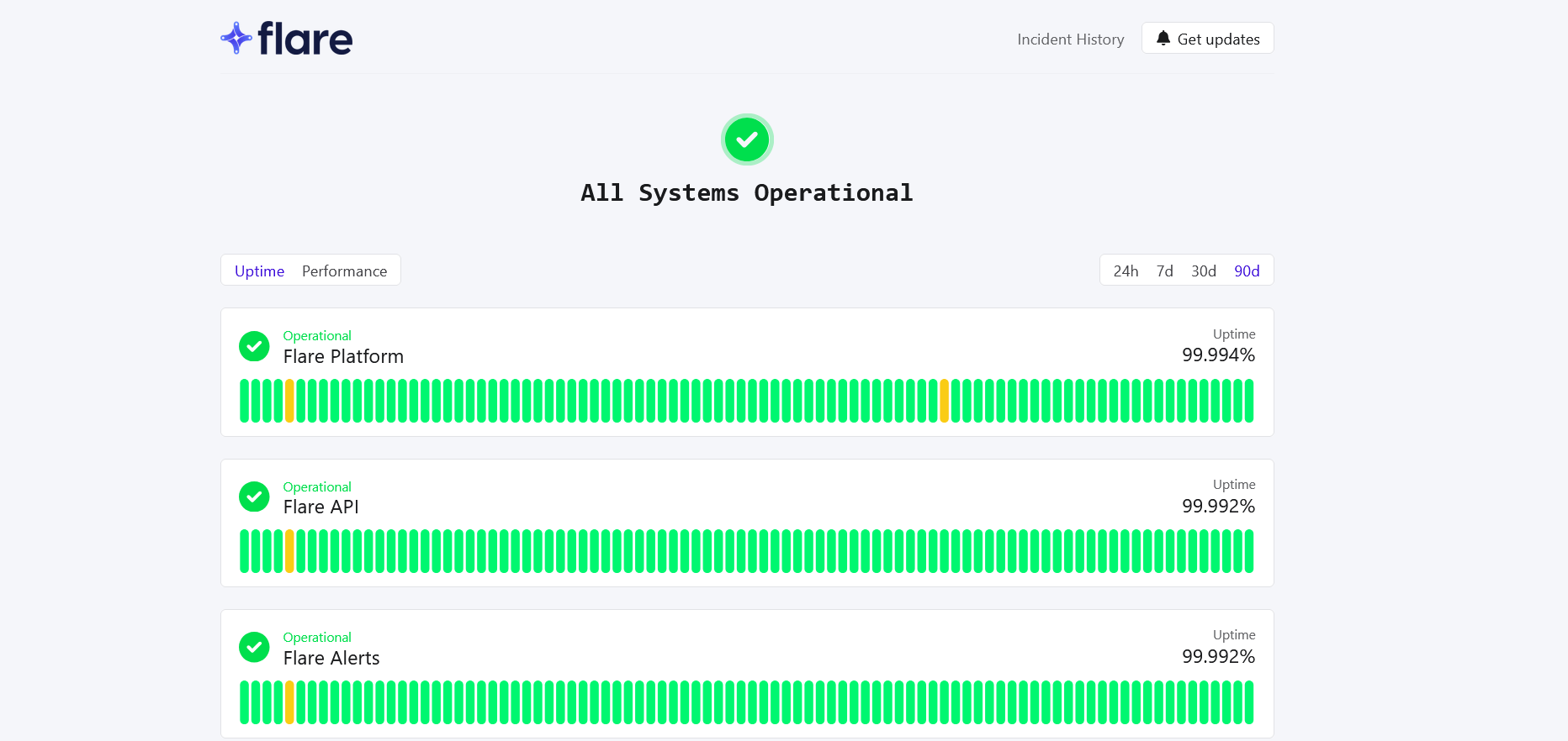 Flare’s status page makes it very easy to check uptime and performance-related information
Flare is a cybersecurity tool that helps ensure user identities can be trusted. Like all good public status pages, it lets you see at a glance how its various services are performing. Mousing over any particular date brings up a pop-up with more information, though the animation is slightly off-putting. You can also flip the display between uptime and performance, and there are easy controls to change the displayed period.
Strengths: Interactive. Adjustable. Powerful.
Deno
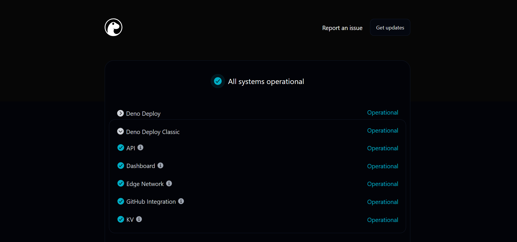 Deno’s minimal style oozes calmness and authority
Deno is an open-source JavaScript runtime with a status page that reflects the technical prowess of its product. As well as looking sleek, cold, and moody, the page's logo speaks to our affinity for stylish animals. The page is very clear and provides plenty of additional information via expanders. Its informational pop-ups work well. We suspect whoever designed this knows their CSS stuff, and perhaps adds neons to their PC.
Strengths: Cool. Elegant. Reliable.
Harvard
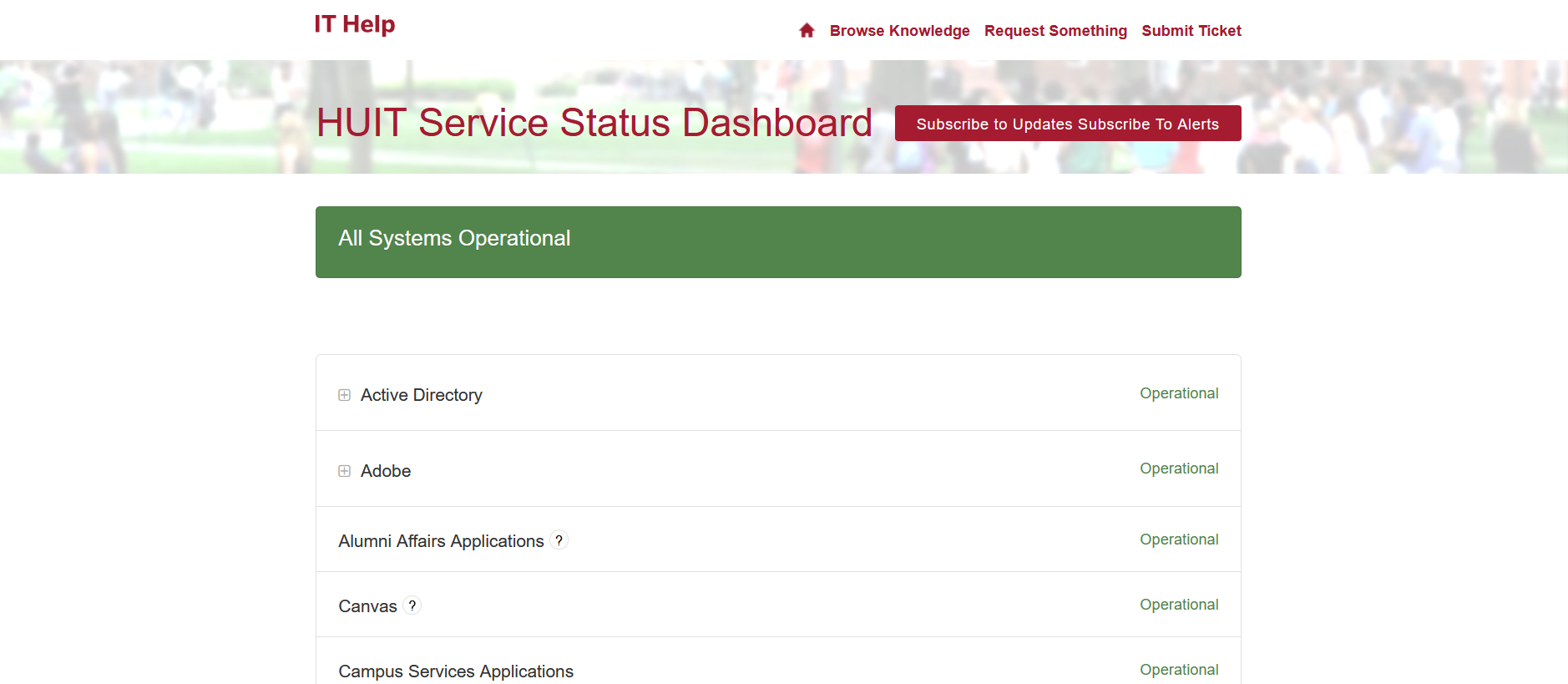 Harvard's status page has a friendly look to it
Harvard is one of the world's most renowned educational institutions. Its status page has a pastoral quality. It uses a subtle green that nods to the header image of the Harvard Yard. In addition to showing the status of various services, it provides useful links that help students easily solve their problems.
Strengths: Calm. Reassuring. Pastoral.
Graphite
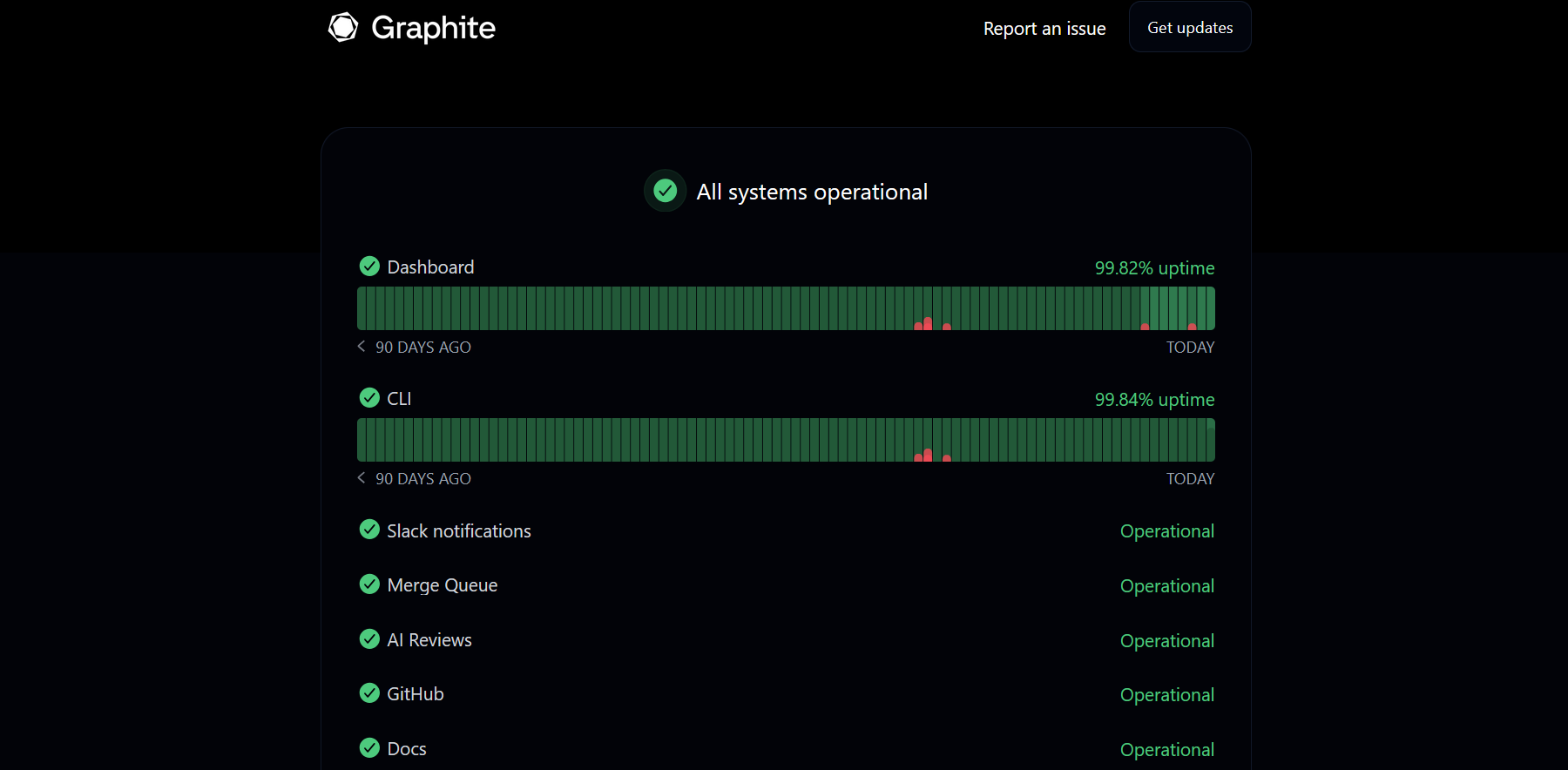 Graphite's status page looks cool, but not at the expense of usability
Graphite is an AI code review platform pitched at developers. Its status page uses green and oozes cold technical sophistication. Its mouseover popups provide additional details, and there's a clear, readable incident log. The only downside is the mildly confusing empty pop-ups on incident-free days.
Strengths: Slick. Clear. Classy.
PagerTree
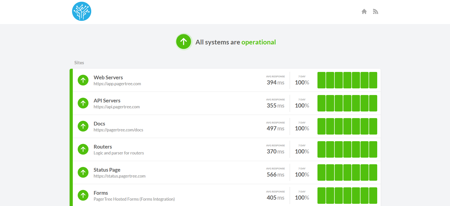 PagerTree's status page is easy to understand, but contains plenty of useful information
PagerTree is a management system for on-call teams. Its bold, clear page includes a brief list of services, with response times and uptime listed in each row. As well as being easy to understand, it includes technical data, and you can click on each day to see more.
Strengths: Bold. Organized. Informative.
Docker
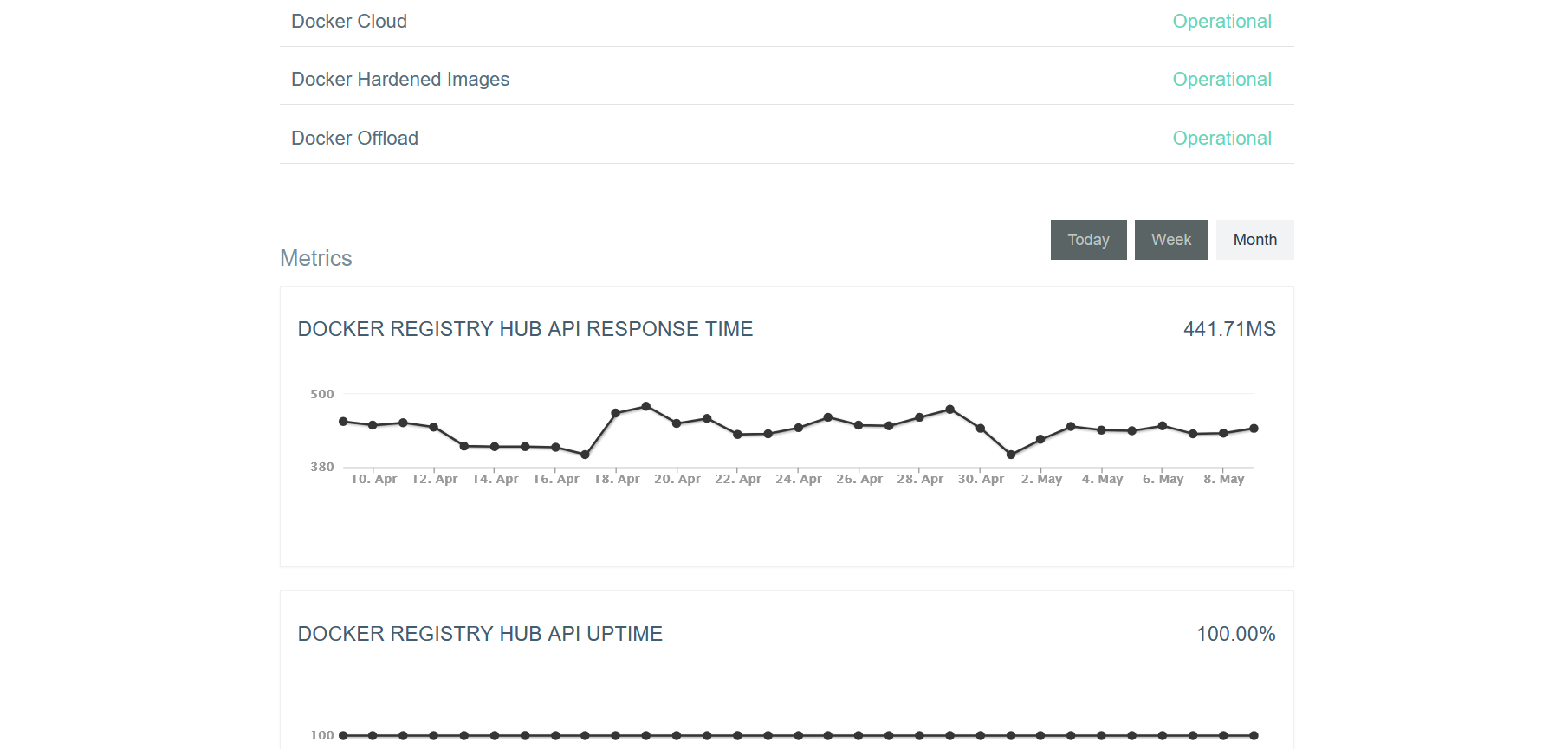 Docker’s status page provides graphs of uptime and response time
Docker is a containerization system that makes deploying software easier and more secure. Its status page is efficient and informative, with details of each service available on mouseover and plenty of metrics below. Docker users are likely to be technical and to pay close attention to performance, reflected in the selection of response-time metrics alongside the more common uptimes on display.
Strengths: Metrics. Efficiency. Detailed.
Vimeo
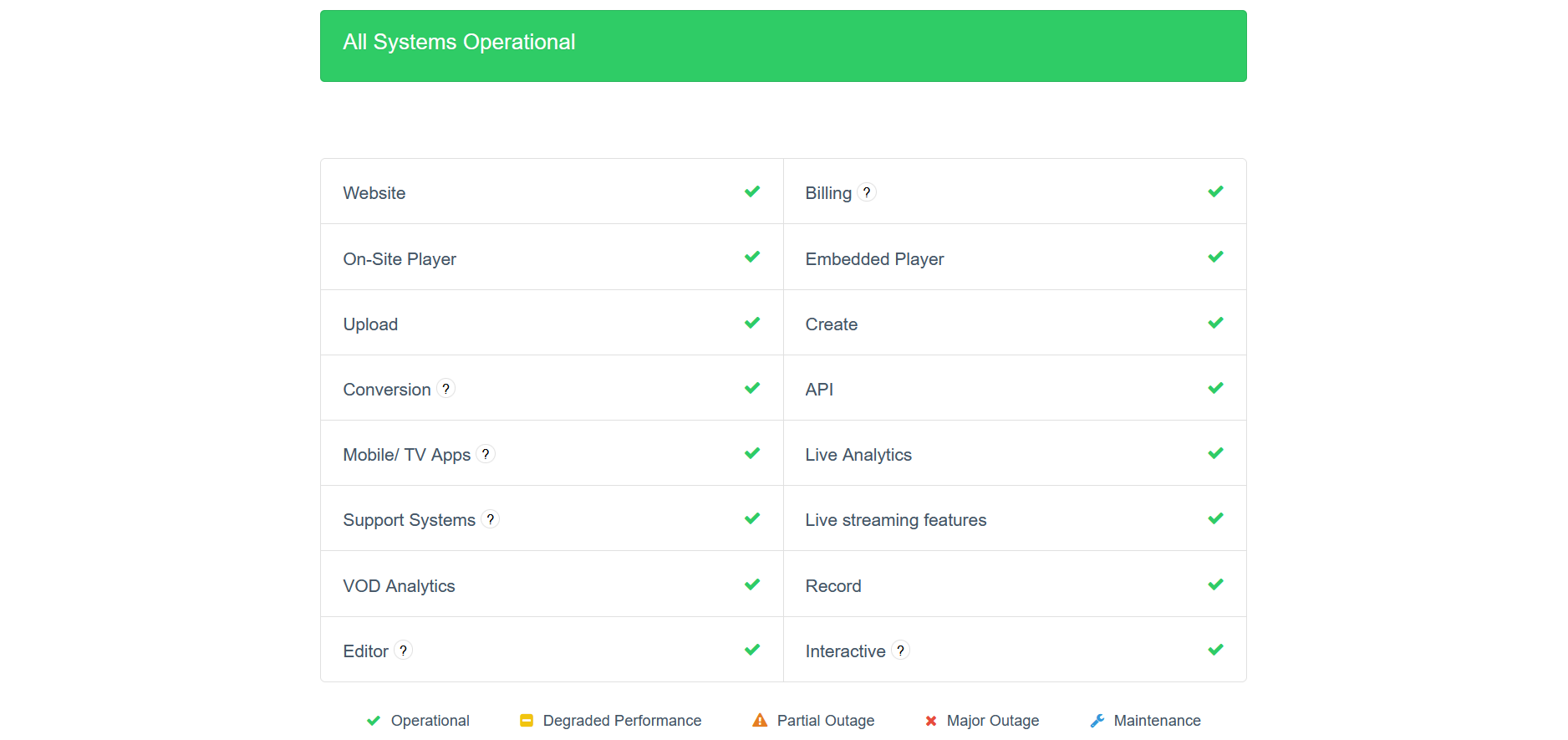 Vimeo's well-organized page fits all its services onto a single screen
Vimeo is a professionally oriented video platform. Its status page shows off its professionalism, with simple ticks indicating that services are working. It also manages to get all its services onto a single page, with a clear incident log underneath. A few links at the top provide additional information.
Strengths: Orderly. Organized. Compact.
RubyGems
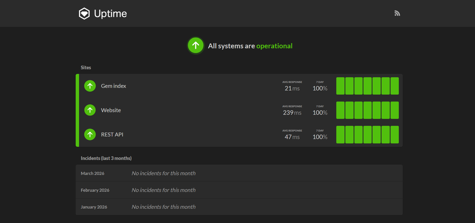 RubyGems uptime page is clear, but packs all the important details
RubyGems lets Ruby users and developers share code packages. Its uptime status page is simple, clean, and easy to understand. Delivered by Honeybadger, it shows both response times and uptime and makes it clear what has been happening recently, which in this case is nothing bad. Its three main services are each displayed on a single line, with their metrics clearly labeled.
As well as being clear enough to read at a glance, it also packs details into its design that you can see without having to scroll or hunt around to find. You can click on individual days to view more detailed metrics, too.
Strengths: Tidy. Detailed. Powerful.
Issues to look out for when creating a status page
When you’re creating a status page, there are a few key things to consider.
Is your status page easy to manage?
You want the status page to take care of itself once it's up. Ideally, it should be able to grab data automatically. It should handle outages across any of its data sources and show that the services have been restored when they come back online.
It should be able to dynamically adjust the display period if that’s relevant, perhaps highlighting longer periods of uptime. If not, it should be easy for you to change—and that goes for all changes you want to make.
If you have an incident log, it should be easy to update, preferably by pulling data directly from your logging system, with an easy way to edit it if you need to provide users with more specific details.
Does your status page integrate well with monitoring tools?
Status pages need data; the more the better. Wiring it all up manually is one approach, but it's slow and expensive. Automatically piping it in is faster and more efficient. Honeybadger gives you a simple set of tools to do that, with key features such as uptime checking and cron job monitoring, so you can use it to track services that might otherwise be tricky to monitor.
Incident management features are great to have too, allowing you to report to your users, provide a comprehensive overview of your service status, and significantly enhance the customer experience. Atlassian Statuspage has these, as does Honeybadger.
Is your status page showing users what they want?
Simplicity is key here. Most of the pages listed above are not flashy. Why? Customers are in a rush—possibly even a panic—when they struggle to connect to a service. They don’t want to be distracted. They need to know what’s going on, quickly.
Visually appealing status pages are fantastic, but utility should always be the priority. Make sure your page aligns with what your users want and need (which aren’t always the same thing). This requires some empathy. Gathering quality feedback can help, and providing a quick way for users to contact you on your status page may also help you understand their needs.
How to create the best status page in Honeybadger
Now that we know what makes the best status pages great, it's time to set up our own. Fortunately, Honeybadger makes that very easy. It provides hosted status pages that include several advanced features.
With it, you can create a status page in just a few clicks. With a little more work, you can also integrate with its monitoring tools, letting you check your uptime or monitor cron jobs, for example. Honeybadger also has incident management features, letting you inform users about recent events. As well as a website, you can use a Honeybadger status page to monitor your apps, APIs, or other services.
To begin, you first need a Honeybadger account, so go to Honeybadger’s homepage and create one if you haven’t already.
Next, navigate to Honeybadger's status page management screen, then click the “Create your first status page” button. You could also check out the guide to uptime monitoring if you want to learn more.
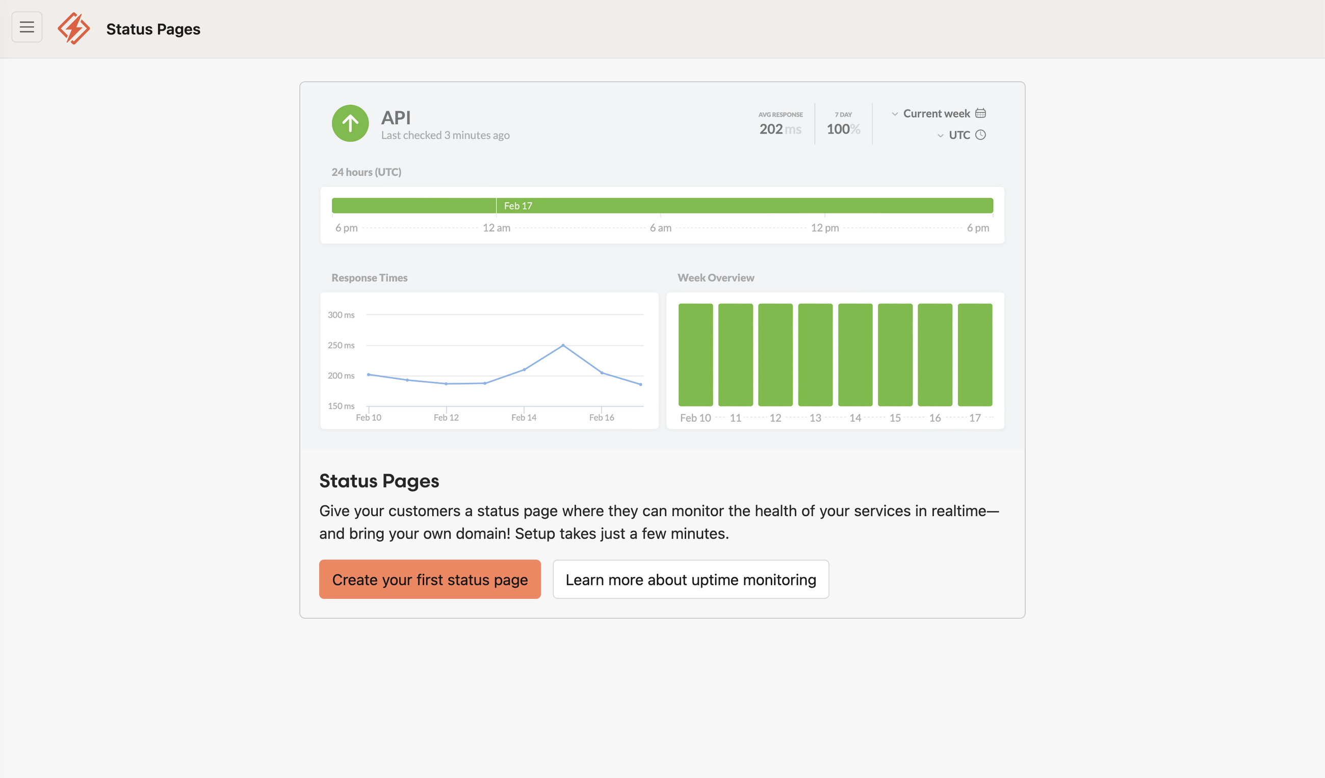 Clicking this button is the first step to getting your own page set up
That will take you to the new status page screen. Give your page a name and fill in the details as needed.
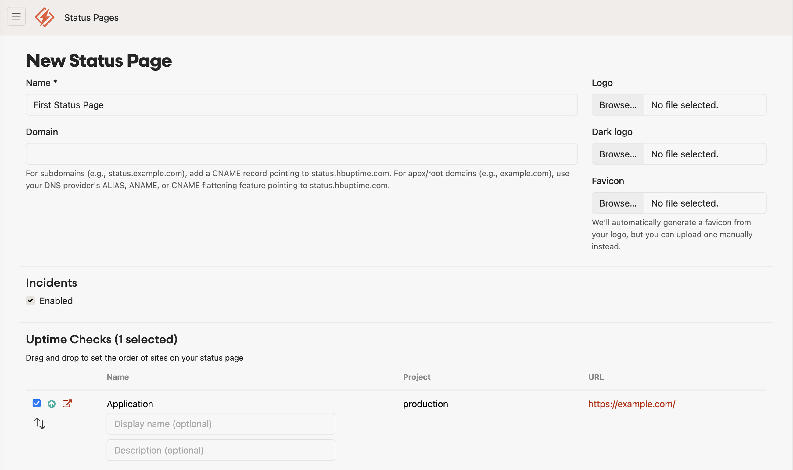 The new status page screen is nice and simple, but also contains powerful extras
You can also display a message to users of your application or website, connect Google Analytics, and more. Business accounts can add password protection and extra customizations.
When you're ready, click “Create Page,” and voila, your page will be created. It could hardly be more user-friendly. It follows a basic status page template. There are controls that let you edit or delete your page, create incidents, view ongoing incidents, and view a log of historical data.
Here's the page in all its glory.
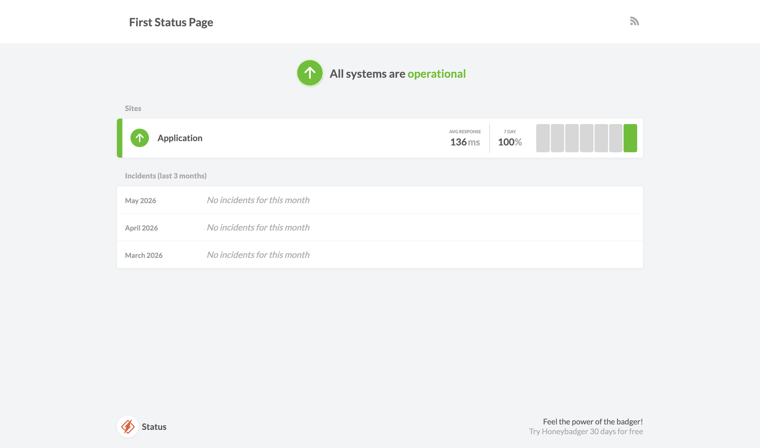 Here’s a newly created Honeybadger status page
This is just a taste of what you can do. From here, you can add a logo, including a separate one for dark mode. You can add a favicon too, so it matches your site. You can also attach your own custom domain. Take a look through the Honeybadger documentation to learn what else is available.
Creating a status page is easier than you think with Honeybadger
A status page is a key part of your product offering, helping you keep users informed and building trust with customers. Building one shouldn’t be an afterthought. Take care to build one that delivers everything your clients want and shows your ability to deliver a consistently reliable product.
If these status page examples have inspired you, it's time to start working on your own. Fortunately, you can have a well-designed status page ready within minutes. Sign up for a free trial of Honeybadger and see how easy it is to build your own.

Written by
James KonikUncertain if he's a coder who writes or a writer who codes, James tries to funnel as much of this existential tension as possible into both of his crafts. When he occasionally hops out from behind his keyboard, you can find him jogging and cycling around suburban Japan.